Tailwind CSS vs. Bootstrap: Which Framework Delivers Better Responsive Design?
In today's mobile-first world, responsive design has become essential rather than optional. With over 60% of web traffic originating from mobile devices, websites must deliver flawless experiences across all screen sizes.
Choosing the Right Framework for Responsive Development
When building responsive layouts, developers typically debate between two leading CSS frameworks: Tailwind CSS and Bootstrap. This comparison examines their core capabilities for modern responsive web design.
Understanding the Frameworks
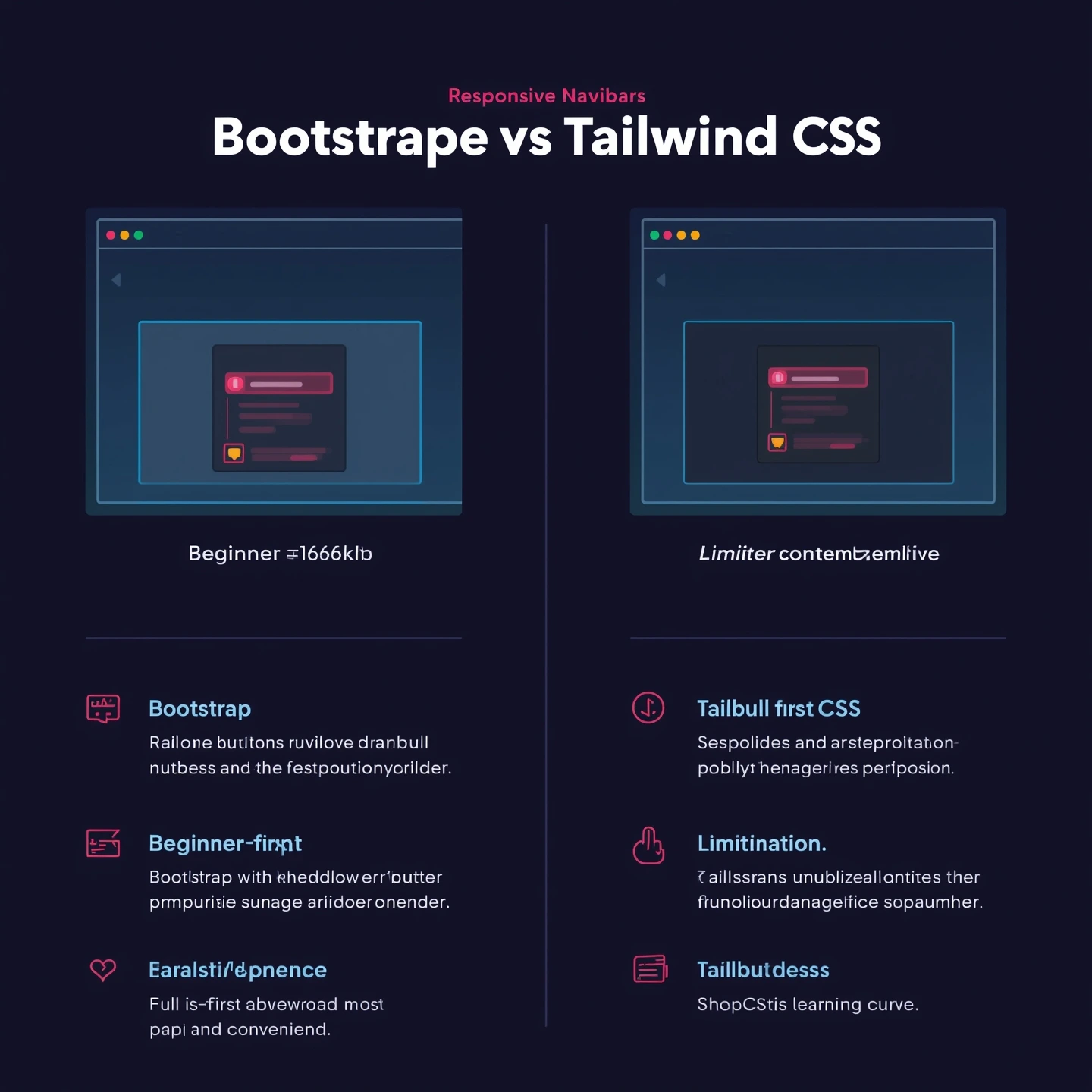
What is Bootstrap?
Originally developed by Twitter and released in 2011, Bootstrap has grown to become one of the world's most widely-used CSS frameworks. Its comprehensive feature set includes:
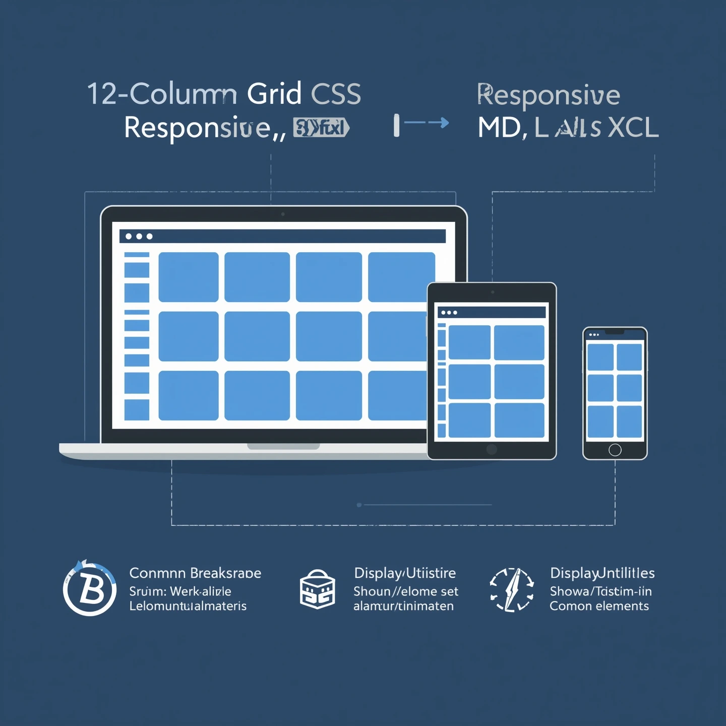
- A responsive 12-column grid layout system
- Pre-designed UI components and templates
- Built-in responsive design capabilities
Key Bootstrap Features for Responsiveness
12-Column Grid System
Flexible layout structure that automatically adapts to different screen sizes
Responsive Breakpoints
Standardized device size categories (xs, sm, md, lg, xl, xxl) for precise control
Display Utilities
Prebuilt responsive visibility classes (show/hide elements on specific devices)
Tailwind CSS
What is Tailwind CSS?
Tailwind CSS, launched in 2017, Tailwind CSS revolutionized frontend development...
- A comprehensive set of atomic utility classes
- Complete design control...
Key Responsive Features
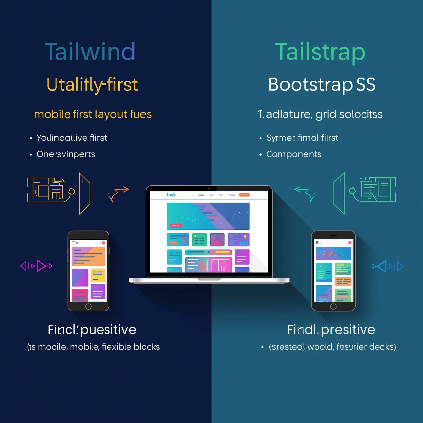
Mobile-First Philosophy
Designs are created for mobile devices first...
Configurable Breakpoints
Customize screen sizes...
...
Responsive Design Philosophy
Bootstrap's Approach
Bootstrap follows a component-based model with a fixed grid and set breakpoints. Developers use .row and .col classes to define layouts, and Bootstrap automatically adjusts the design across devices.
Advantages
- Beginner-friendly
- Fast to create consistent layouts
- Comes with prebuilt responsive components
Limitations
- Less flexibility for fully custom designs
- Can feel "generic" if not customized
<div class="container">
  <div class="row">
    <div class="col-sm-12 col-md-6 col-lg-4">
      Responsive Column
    </div>
  </div>
</div>
Tailwind CSS's Approach
Tailwind CSS embraces a mobile-first mindset, meaning styles are applied from the smallest screen upwards. You have total freedom to control exactly how each element behaves at different screen sizes.
Advantages
- Extreme flexibility and customization
- No need to override predefined styles
- Perfect for unique, branded designs
Challenges
- Steeper learning curve for beginners
- Requires more setup for components
<div class="text-base md:text-lg lg:text-xl xl:text-2xl">
  This text responds to different screen sizes
</div>

<!-- Mobile-first column layout -->
<div class="flex flex-col md:flex-row">
  <div class="w-full md:w-1/2">...</div>
  <div class="w-full md:w-1/2">...</div>
</div>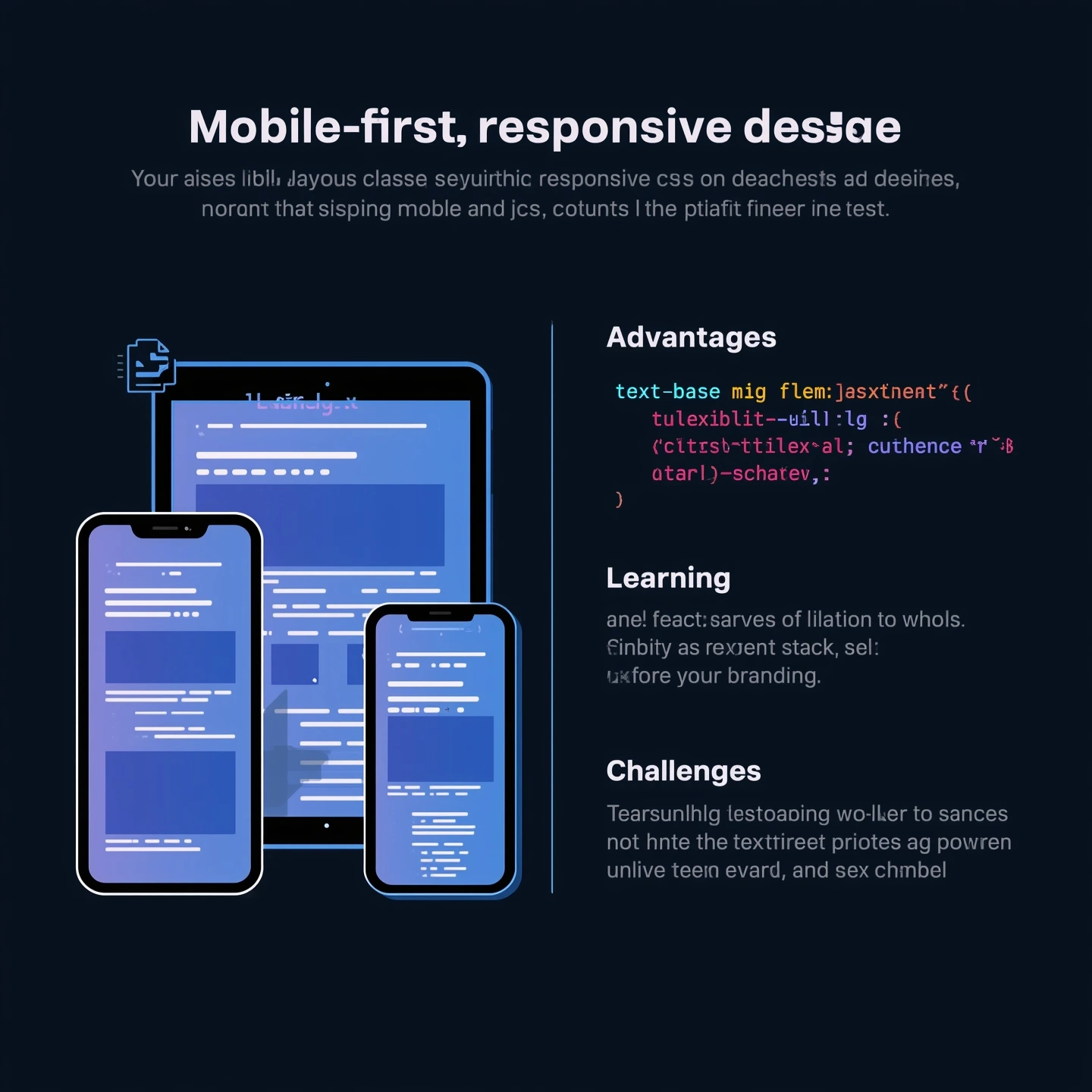
Performance & Optimization
Bootstrap
Ships with significant unused CSS unless customized through Bootstrap's Sass build process.
ℹ️ Optimization Tip: Requires manual customization to remove unused components
Tailwind CSS
Integrates with PurgeCSS to automatically eliminate unused utility classes in production.
ℹ️ Optimization Tip: Configure purge options in tailwind.config.js
📌 Performance Winner: Tailwind CSS
Tailwind's PurgeCSS integration provides significant performance advantages by removing unused CSS automatically.
Learning Curve & Developer Experience
Bootstrap
- ✅ Beginner-friendly with prebuilt components
- ✅ Extensive documentation with copy-paste examples
- ⚠️ Limited to predefined design system
Tailwind CSS
- ⚠️ Steeper initial learning curve
- ✅ Rewards mastery with unlimited customization
- ✅ Encourages consistent design systems
Which One Should You Choose?
✅ Choose Bootstrap if:
- You want a quick, standard responsive site
- You prefer prebuilt UI components
- You're a beginner in front-end development
Perfect solution for: administrative interfaces, enterprise systems, and quick concept development
✅ Choose Tailwind CSS if:
- You want complete design control
- You're building a custom, brand-focused project
- You care about performance and minimal CSS size
Ideal for: Marketing sites, custom web apps, and design-system driven projects
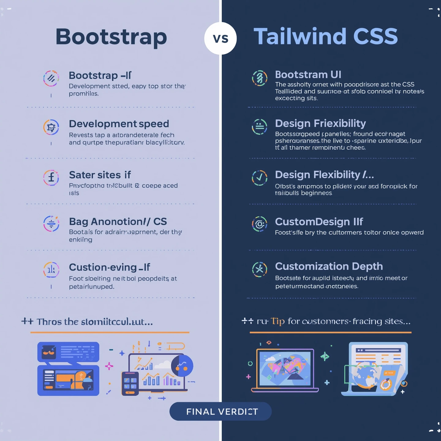
Conclusion
In the battle of Tailwind CSS vs Bootstrap for responsive design, there's no single winner:
Bootstrap Wins For:
- ⚡ Development speed
- 🛠️ Out-of-the-box components
- 👶 Beginner friendliness
Tailwind CSS Wins For:
- 🎨 Design flexibility
- 🚀 Performance optimization
- 🔧 Customization depth
Final Verdict
If you want a unique, highly customized, and performance-focused site, go with Tailwind CSS. If you prioritize speed and simplicity, choose Bootstrap.
💡 Pro Tip: Many developers successfully use both - Bootstrap for admin panels and Tailwind for customer-facing sites!